Gray Duck Concessions
A branding project
Developed a unique logo that perfectly captures the essence of Gray Duck Concessions, strategically employing a palette of pink and light blue to evoke a strong sense of hunger for candy and sweets. This color choice, unusual yet effective within the food truck industry, balances modern aesthetics with a playful nod to Midwestern culture.
The design process was meticulous, involving initial conceptualization, detailed sketching, and multiple iterations based on client feedback. This ensured that the final logo was not only memorable and visually appealing but also deeply reflective of the brand's core values.
The deliberate use of pink and light blue was pivotal in setting Gray Duck Concessions apart, invoking an immediate, mouthwatering connection to the indulgent and sweet treats they offer, thereby tapping directly into the sensory experiences of their target audience.
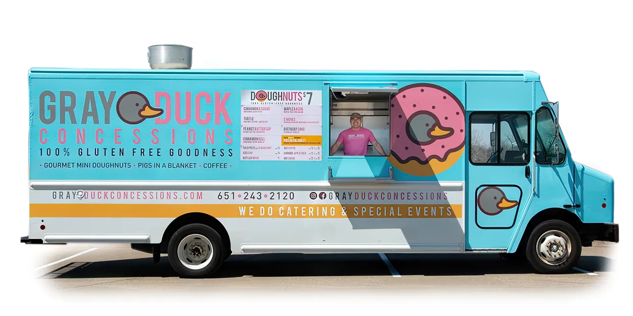
Transformed the food truck into a moving billboard that not only encapsulates the brand's identity but also stands out in the competitive landscape, thanks to a comprehensive competitive analysis of other food trucks in the region.
This analysis informed the design, leading to the incorporation of the logo, brand colors, and thematic elements that reflect the brand’s Midwestern roots and culinary focus, while also addressing gaps and opportunities identified during the competitive review.
Special attention was paid to the layout and usability, drawing on insights from the analysis to ensure the space was both attractive and functional for employees and customers alike. This strategic approach to design, grounded in a deep understanding of the competitive environment, ensures that the food truck not only represents the brand effectively but also appeals directly to the target market, setting Gray Duck Concessions apart from its competitors.
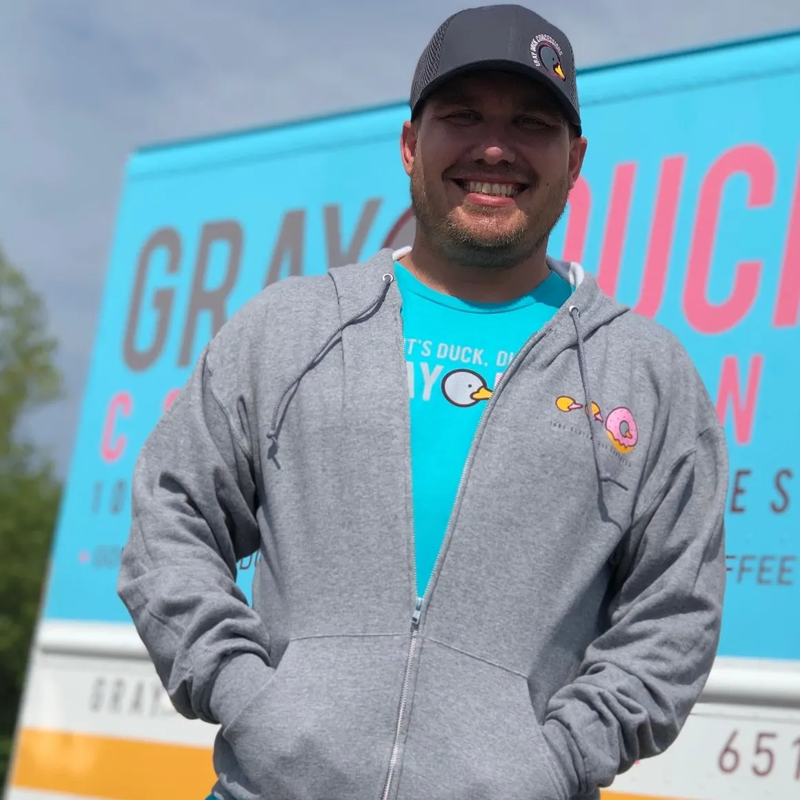
Designed a range of branded apparel, including T-shirts, aprons, and hats for staff. The clothing combined practicality with style, featuring the brand's logo and color scheme. This not only unified the team's appearance but also served as wearable advertising.