Minnesota legalized adult-use cannabis in 2023. Levitated is a locally owned dispensary in the Longfellow neighborhood of South Minneapolis. It's backed by the same investors as Elevated Beer Wine & Spirits and shares its building on Hiawatha Avenue.
The owners wanted a destination dispensary: the easiest, most elevated way to shop, and a store that leads with education instead of just transactions. They needed a brand that could hang on a storefront and a website that could do real work. That meant ranking locally, sending shoppers to online ordering, and staying on the right side of a brand-new set of state advertising rules.
I designed the identity, built the website from scratch, and handled much of the launch: hosting, Google and Apple business listings, the newsletter, and the compliance updates after opening.
5
weeks from the first coded shell to a live site, two months before the doors opened.
02 — Logo, type & color
Elevated's little sibling
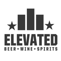
The brief was clear from day one: the dispensary should feel on brand with Elevated, the liquor store its investors already run in the same building. Customers walking between the two stores should know right away that they're related.
The existing brand: Elevated Beer Wine & SpiritsThe new sibling: Levitated DispensariesClick to enlarge
What carried over
The same bones
A mark centered between two stars, sitting on a heavy, squared-off wordmark
A widely tracked descriptor line underneath: BEER + WINE + SPIRITS becomes DISPENSARIES
Matching letterforms. ITC Machine Medium was the closest typeface I could find to Elevated's lettering, and I redrew letters like the I so the word reads evenly
What changed
Its own lift
Elevated's rising bars become three stacked chevrons that point up and shrink as they climb. Elevated goes up, and Levitated takes off
The names already rhyme. The marks make the same joke visually
Green replaces Elevated's charcoal, so each store is still easy to tell apart on a shared block
Color study
Choosing the green
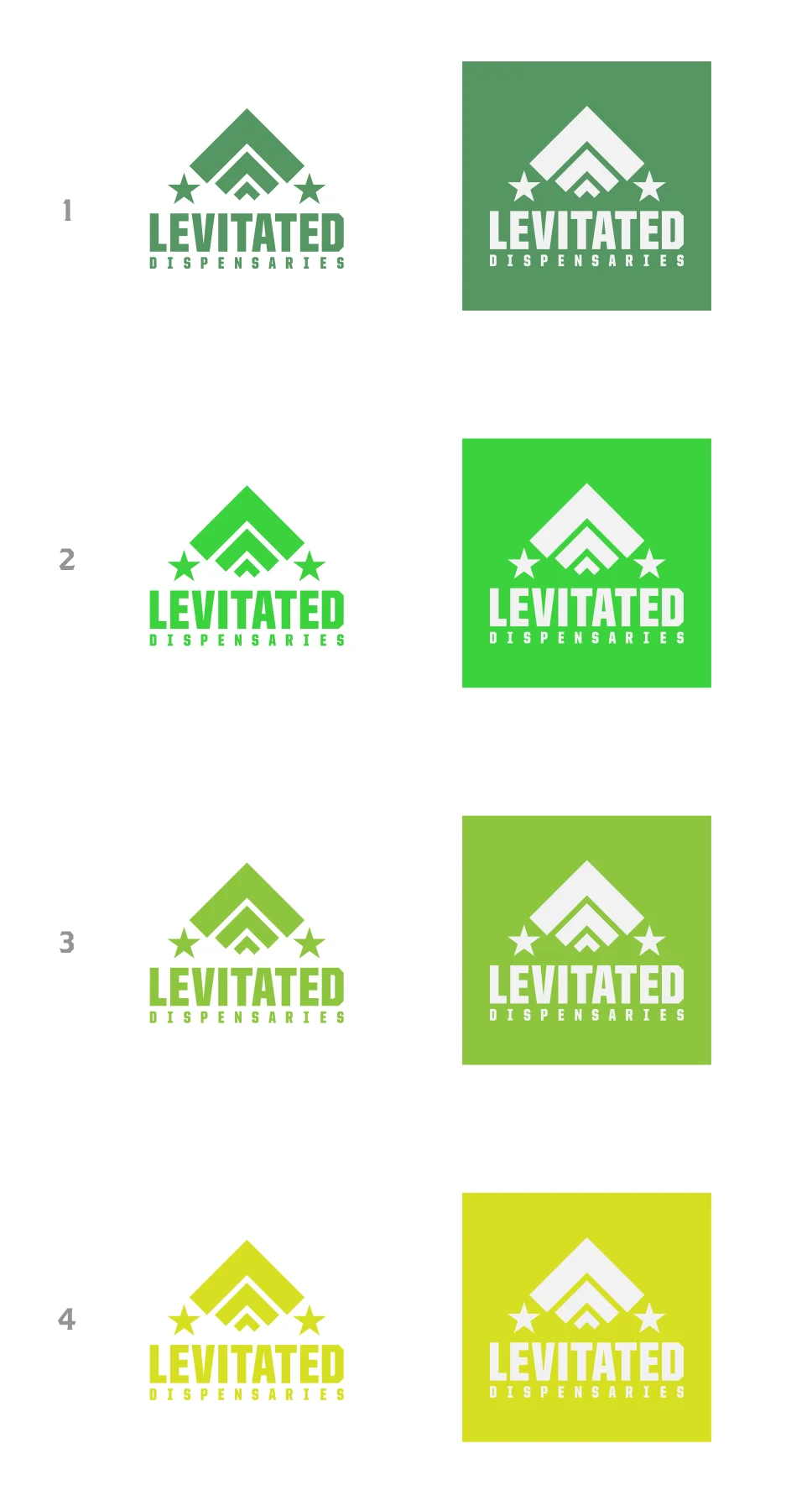
I presented four greens, from a muted sage to a bright chartreuse, each shown on white and reversed out of a solid block so the owners could judge it both ways.
The brighter greens drift toward the neon cannabis cliché
Option 1, a calm, muted green, felt the most premium next to Elevated's charcoal, and it won
It became #559563, the color the whole system and website are built on
Lockups
Balancing the horizontal
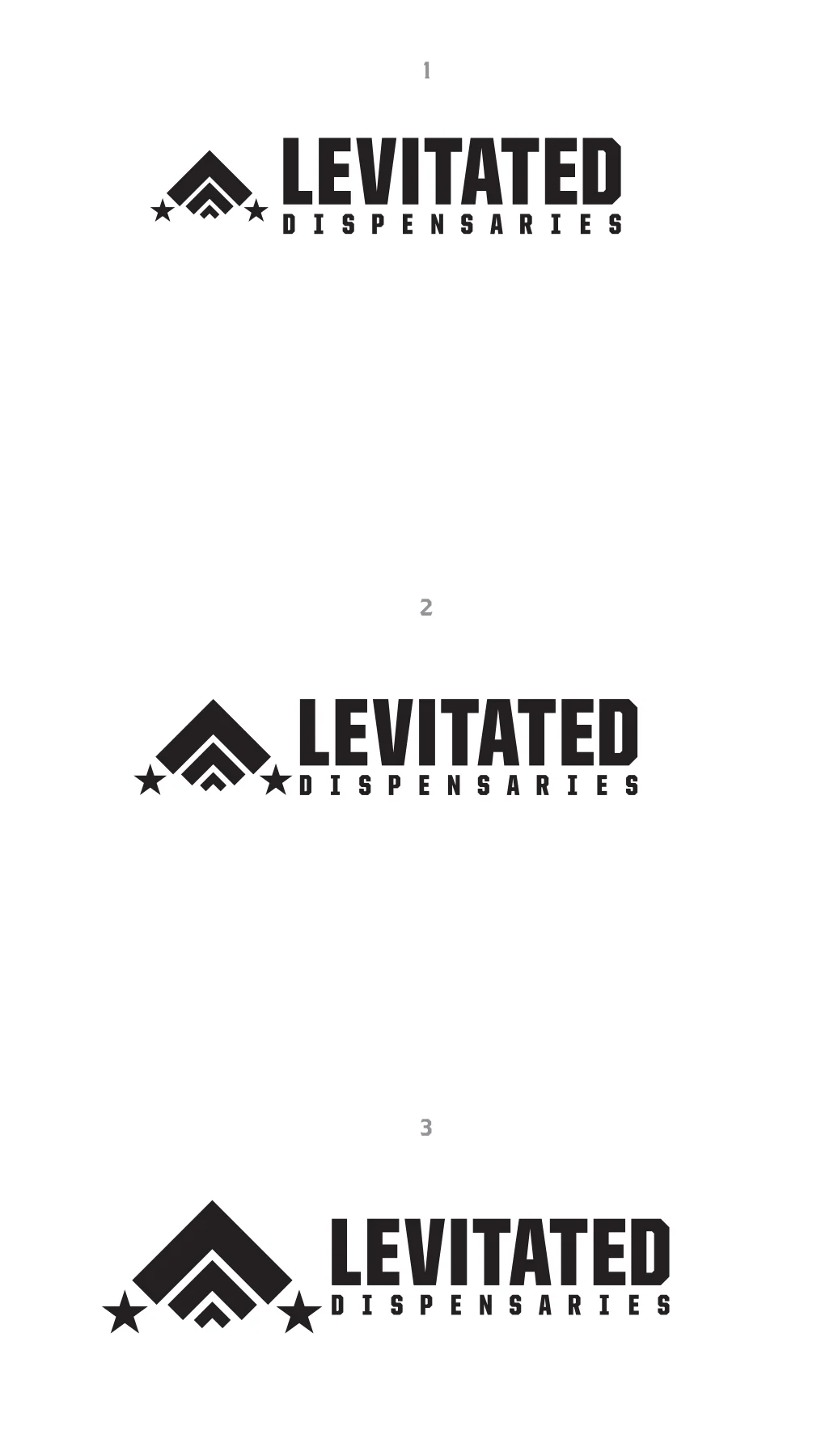
The stacked logo was the hero, but storefronts, headers, and social banners need a wide version. I tested three mark-to-wordmark ratios to find where the chevrons hold their own without crowding the name.
Signage
One store, one sign
Ahead of opening, the owners needed a large horizontal banner for the storefront. They were still deciding between "Dispensary" and "Dispensaries", and the banner had to share space with Looner Cannabis, a signage partner.
Rebuilt every lockup with a singular "DISPENSARY" line
Enlarged and tightened that line so it matches the width of LEVITATED
Turned the full export kit around the same evening
#559563
Levitated Green
The primary brand color. On white it's 3.5:1, so it's used for large type, buttons, and UI, not for body text.
#3D6E48
Deep Green
A darker partner at about 5.4:1. It handles links and small labels, so the green still passes WCAG AA at body size.
#FAFAF7 / #1F1F1F
Warm neutrals
A warm off-white page and near-black text are easier on the eyes than pure black on white. Merriweather headings add a calm, editorial voice.
03 — Strategy
Own the search, rent the checkout
Levitated sells through Flowhub, a cannabis point-of-sale system that handles inventory, payments, and compliance in a hosted online store. The big question was how much of that store the website should try to rebuild.
Option A
Just link out
Cheapest, but every search for flower near me lands on Flowhub's domain, not Levitated's.
Option B ✓
SEO landing pages
Indexable category and brand pages on levitateddisp.com, each with a clear button into the matching Flowhub category to order.
Option C
Headless storefront
Pull live inventory through the API and render every product natively. It's the best SEO, but too much build for a store about to open.
I recommended the middle path. When someone searches "buy flower Minneapolis," they should land on Levitated's site and then move to Flowhub only to check out. That gets SEO value on the brand's own domain with no API work, no duplicate-content issues, and low upkeep. A full headless build stays on the table for later.
The owners set up their category tree in Flowhub, and I matched it page for page: flower, pre-rolls, vapes, edibles, concentrates, CBD, tinctures, accessories, and non-taxed accessories.
The website's job is to be found and to explain. Flowhub's job is to take the order.
04 — Website
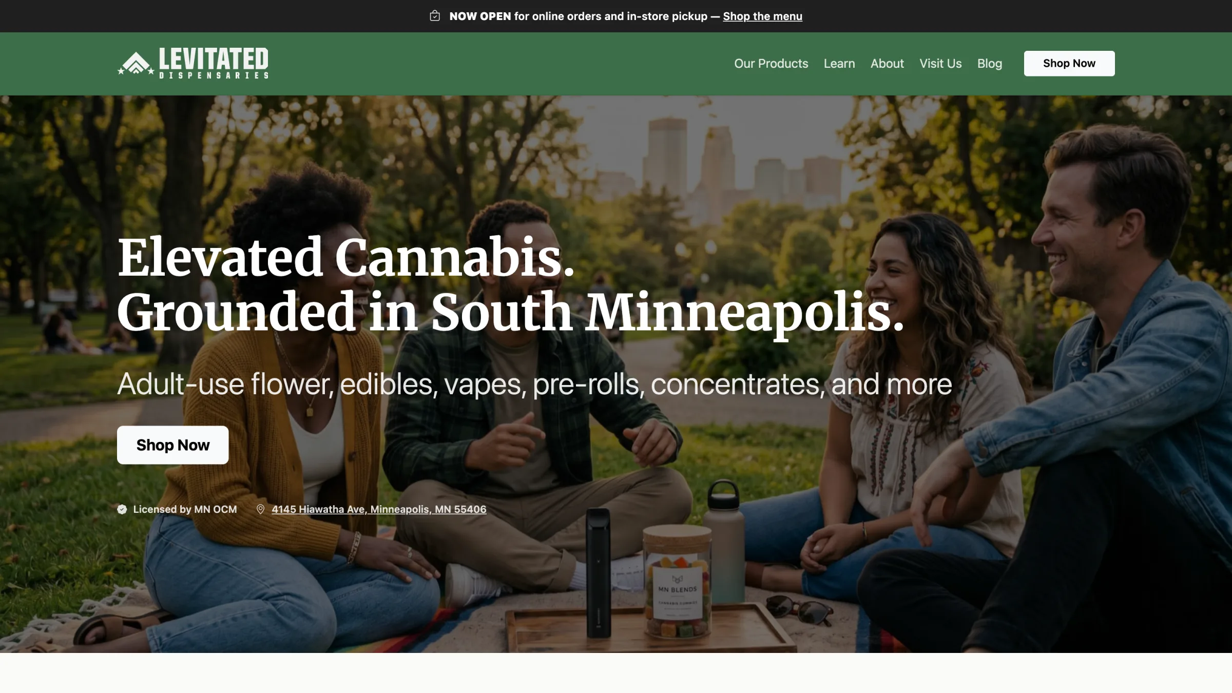
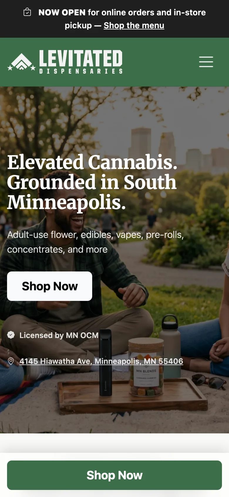
Elevated cannabis, grounded in South Minneapolis
In late May I put a working shell online for the owners to click through. From there we worked in tight feedback rounds: they sent numbered notes, I sent back numbered fixes, often the same day.
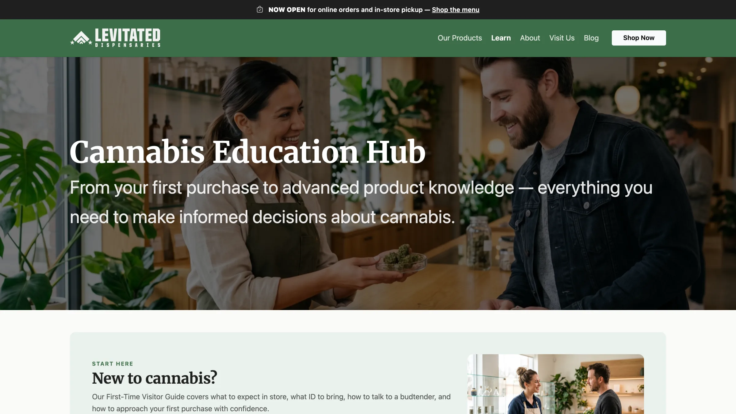
The Education Hub on levitateddisp.comClick to enlarge
Shop
Category pages that convert
Nine category pages, each with indexable copy and a "Shop Now" button into Flowhub
Online ordering for in-store pickup, usually ready in about 20 minutes
Delivery and rewards pages ready to switch on as those services roll out
Learn
Education first
Six guides: Cannabis 101, Product Types, Dosing, Methods of Consumption, Minnesota Cannabis Law, and a First-Time Visitor Guide
An FAQ that answers payment, ID, and pickup questions before anyone has to ask
Local
Rooted in the neighborhood
About, Visit, and Careers pages built around Longfellow and recognizable Minneapolis places like Bde Maka Ska
Job postings that route to a hiring inbox, plus a "Now Hiring" homepage section at launch
Stay in touch
Blog, newsletter, chat
Ghost runs headless behind the site's own blog template for posts and email
A contact form and a live chat that knows store hours, customized in code
Under the hood
Hand-coded and fast
No page builder. The site is PHP with shared partials, Bootstrap 5, and Sass, with the brand colors set as variables so every component inherits them.
Mobile-first layouts, with a Shop Now bar along the bottom of the screen on phones
Per-page titles, descriptions, Open Graph tags, and JSON-LD local business schema
An accessibility pass, plus a public accessibility statement covering what we can and can't control
Moved off a site-builder plan to real hosting so the code could run
05 — Compliance
Designing inside the rules
Cannabis is one of the most tightly regulated things you can advertise. Minnesota's Office of Cannabis Management sets rules on who can see the site, what it must say, and what it must never claim.
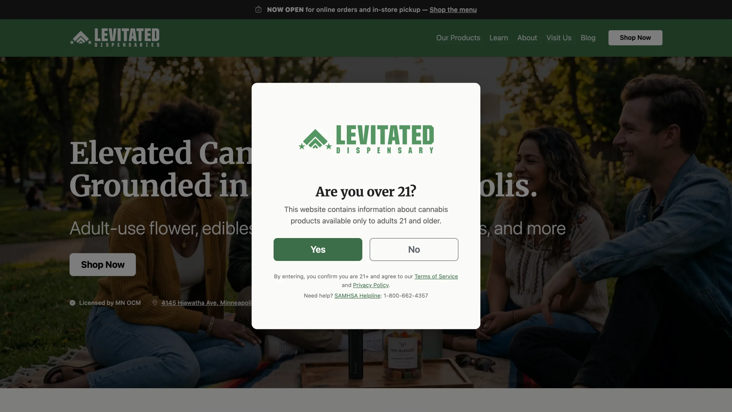
The age gate, shown once every 30 daysClick to enlarge
Age gate
21+ before anything else
My first version asked for a date of birth, the most cautious option. The owners preferred a simple yes/no, which is the norm for local dispensaries. I rebuilt it as a single-click modal that remembers the answer for 30 days, so returning shoppers don't see it again.
Required warning
The OCM disclaimer, everywhere
When the state issued new required advertising language in August 2026, I replaced the short footer warning with the full prescribed text on every page.
Copy review
No health claims
Working through a review checklist from the owners, I removed effect and wellness language across the category pages ("relief," terpene effects, "cleaner than flower"). I also rewrote the consumption, returns, and purchase-limit copy so it matches current law.
Accessibility
A dialog, not a headline
After launch, the age gate turned out to be the first H1 on every page. I changed it to a proper role="dialog" with an H2 label. It looks the same, but search engines and screen readers now see each page's real heading.
06 — Launch
Live before the doors opened
2024
A long runway
Licensing in a brand-new market takes time. The identity went to work two years before opening day, starting with "Coming Soon" posts for Instagram and Facebook that announced both planned markets, White Bear Lake and Minneapolis.
The site went live in late June 2026, two months ahead of opening day. That gave Google time to find it. In the meantime, every Shop button pointed to a "store coming soon" page and a notify-me signup, so early visitors became newsletter subscribers instead of dead ends.
June 2026
On the map
Google requires a live video walkthrough to verify a business, so I went to the space and streamed it. The Google Business Profile went live the next day. Apple Business followed in August.
August 27, 2026
Opening day
The newsletter told subscribers the wait was over. The site switched from "coming soon" to live Flowhub ordering for pickup.
Since then
Ongoing care
Cross-promotions with Elevated next door, medical-card offers, Ghost post metadata wired into share previews, and Search Console indexing fixes.
07 — Outcome
A brand that rose with the store
Where it landed
Open, findable, and compliant
A complete identity, from the storefront banner to the favicon, tied to its sister brand next door.
An SEO-first site that keeps search traffic on Levitated's domain and hands buyers to Flowhub only at checkout.
Live on Google and Apple Maps, with a newsletter list built before opening day.
What I learned
In a regulated category, the copy is part of the design
Every headline and product blurb is also a legal statement. Building in compliance review from the start beats chasing it after launch.
Launching early, before the store opened, turned the waiting period into an audience.
Caches lie. After a big content change, redeploy everything and check from the outside, not just your own browser.