The problem is discovery, not capability
Customers wanted to personalize, but often didn't know where a feature lived, or that it existed at all.
 Vunley Long
Contact
01 — Problem
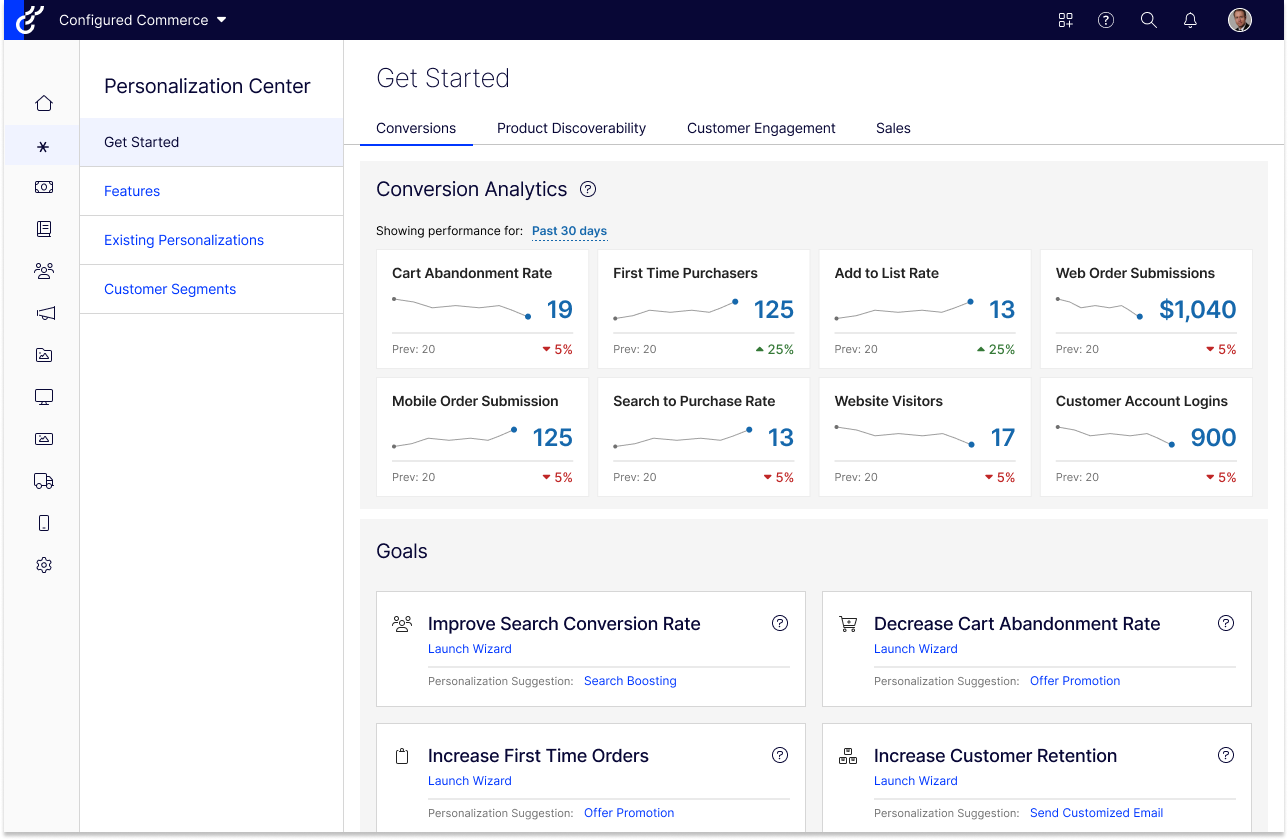
personalization features, spread across different corners of the admin.
Configured Commerce gave B2B sellers more than 70 ways to tailor the buying experience, but there was no single place to find them. A feature customers can't find is a feature they don't use.
Goal
Make personalization easy to discover and easy to act on, so any team can tailor its storefront without needing a dedicated marketing department.
02 — Research
I interviewed members of our Client Advisory Board (CAB) about how they find and use personalization. Three themes came up again and again.
Customers wanted to personalize, but often didn't know where a feature lived, or that it existed at all.
Personalization drove frequent support tickets, and the help docs were hard to find and interpret. That costs clients and our support team time, and it doesn't scale.
Most CAB members asked for help deciding what to personalize to stand out, especially mid-market teams with enterprise demands and small staffs.
03 — Shared goals
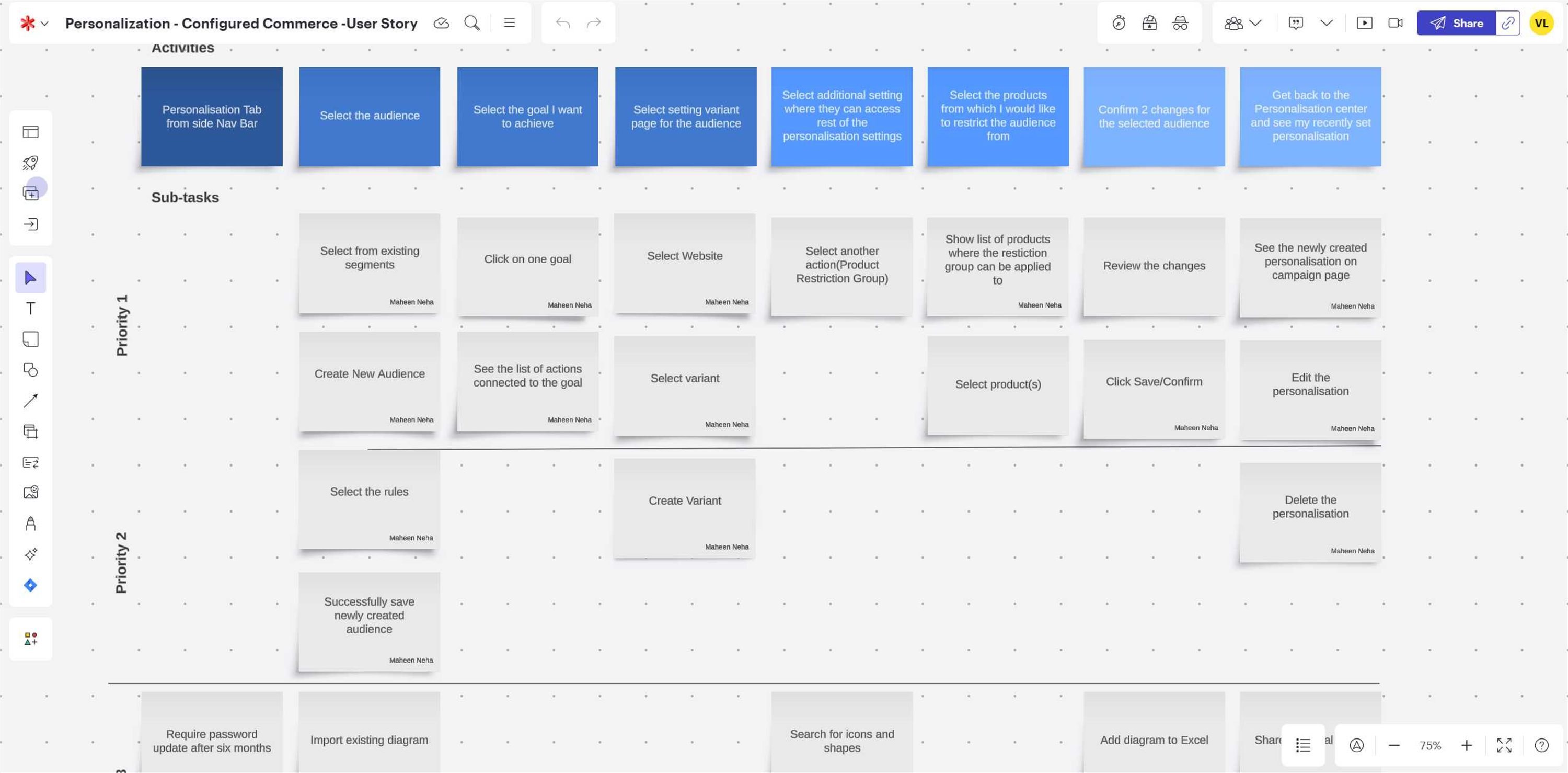
I brought the research into a whiteboard session with product and engineering stakeholders so we could agree on what the Personalization Center had to do before anyone designed a screen. Each goal links directly to a part of the final design:
04 — Key design decisions

Customers think "I want fewer abandoned carts," not "I need the Offer Promotion feature." So the entry page leads with goals. Each one recommends a feature and opens a wizard that walks through setup.
The tabs follow the same idea: Conversions, Product Discoverability, Customer Engagement and Sales, with relevant metrics shown next to the goals they relate to.

For users who already know what they want, the Features page lists all 70+ features grouped into familiar areas: Catalog, Promotions, Content, Search, and Shipping & Fulfillment.
Every feature gets a one-line, plain-language description of what it does for the buyer, so the page also serves as a way to discover features.

Customers had no single view of the personalizations they'd already set up. Existing Personalizations lists them all, filterable by feature type, customer segment and date, with favorites pinned to the top.

Almost every personalization targets a customer segment, so I moved Customer Segments into the Personalization Center instead of leaving it in a separate area. Moving it has a cost for long-time users, and that trade-off came up in testing.
05 — Iteration
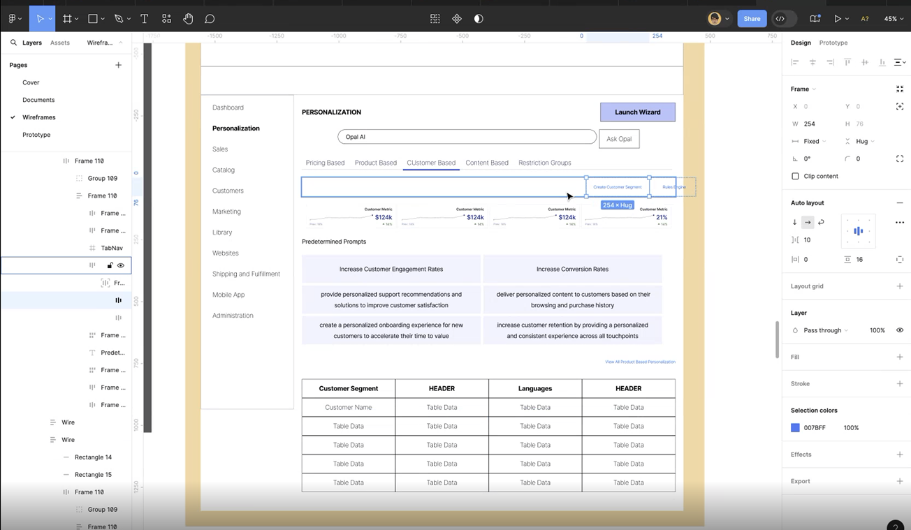
I kept the wireframes rough so we could change them quickly, and reviewed each round live with internal stakeholders and CAB members. Across those rounds, the landing page changed in three ways:
06 — Validation
I shared the hi-fi prototype with 30 CAB members. They rated each page on desirability and perceived value, and told us why.
Desirability uses our UX team's internal 0–100 likeability score, which shows how much someone would want to use the page. Perceived value was rated separately.
Customers liked the page, but worried that the Goals might be too generic for their particular business.
Met expectations by putting every feature in one place. Some asked for better organization within the list.
The highest score. It met a need customers hadn't been able to cover before, helping small teams keep track of their campaigns.
The move made sense to customers, but they warned it could confuse long-time users.
[Is this where] you can improve your goals based on your site and metrics? If so, I think this would be great to add.
It appears to be a way to view and track current personalization tactics… which would also be fantastic!
What the feedback pointed to
Make Goals fit each business, add structure to the features list, and help long-time users find features that moved.
07 — Outcome & takeaways
The Personalization Center didn't ship before my role was eliminated in a company layoff. It was still a complete, customer-validated concept: research, wireframes, a hi-fi prototype, and desirability results from 30 CAB members.
Next project — 03
Vendor Managed Inventory →