Agency sales
- Creates and manages campaigns
- Oversees inventory, vendors, and clients
- Generates proposals and invoices
 Vunley Long
Say hello
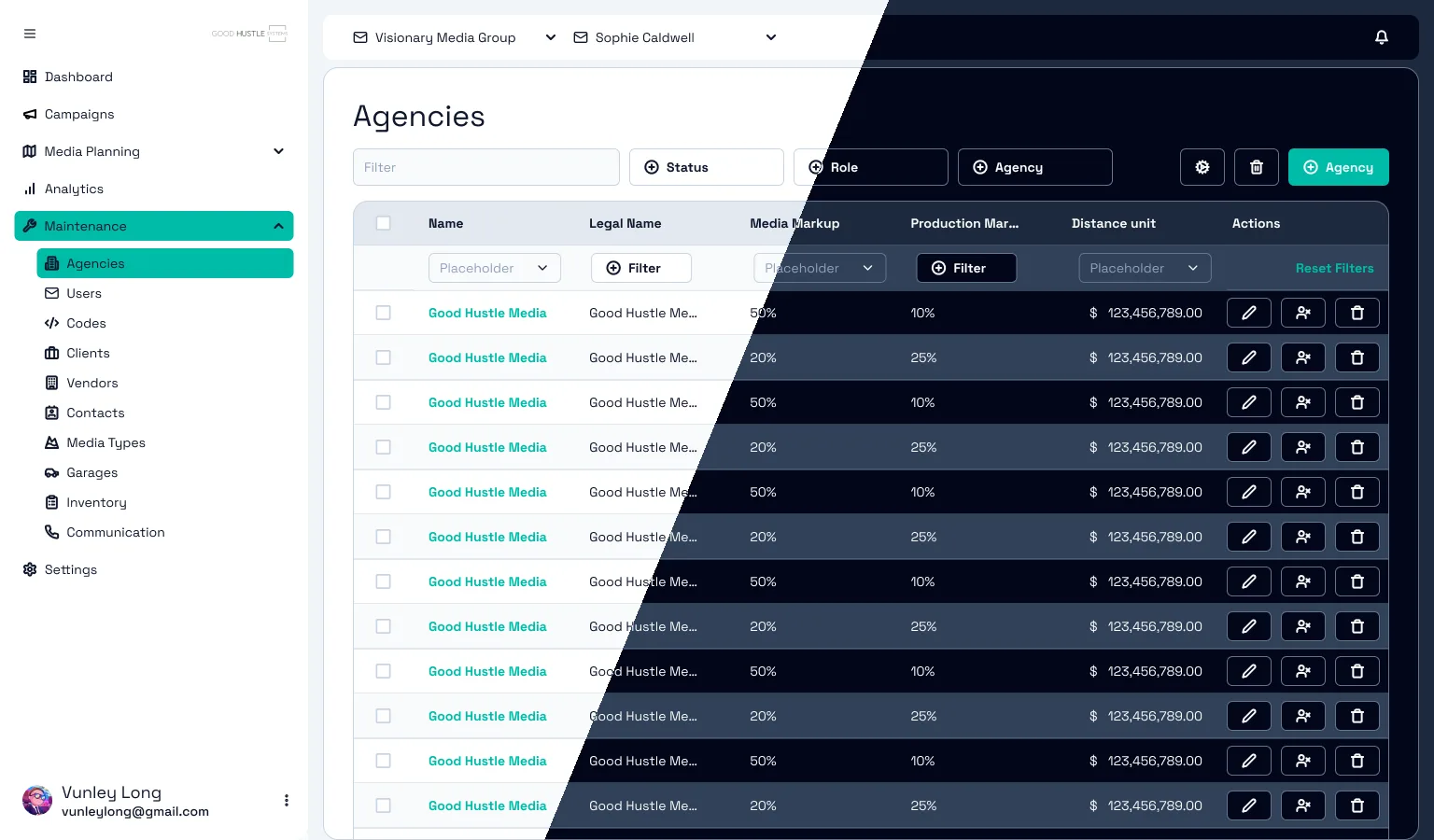
01 — Problem
Good Hustle Media helps agencies buy out-of-home advertising: billboards, transit, street furniture, and more than 40 other media types. Its platform worked, but it looked and felt dated. The brief was blunt: make it less robotic, "really push the envelope," and don't feel tied to the existing branding.
month to build a system that two developers could use for every screen that came after.
Goal
Give a small dev team a modern, accessible, themeable design system whose names match their code exactly, so they can rebuild the platform screen by screen without waiting on a designer.
02 — Research
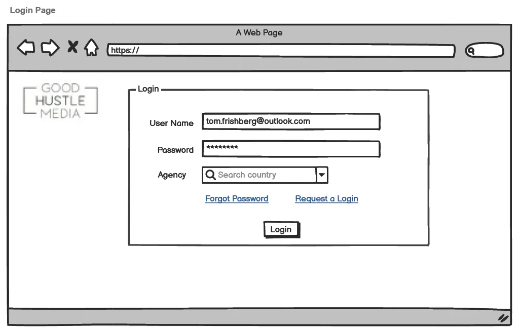
The platform sits between three businesses, and each one comes to it with a different job. I mapped who logs in and what they need from their first screen.
I walked through the products of four companies in the space and noted each one's palette and vibe. Do Media is Good Hustle's biggest competitor. Blip and Adstruc (Vistar Media) sell billboard space with self-serve tools.
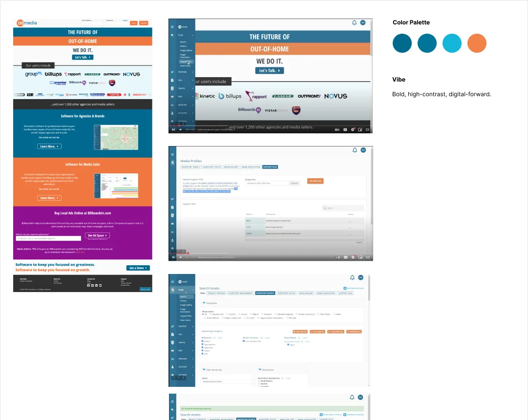
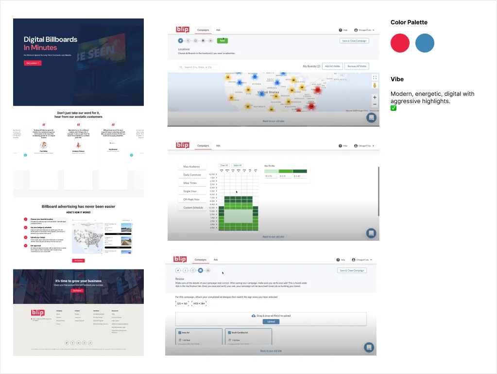
Deep navy, red-orange, bright cyan, and pure black on white showed up again and again. To stand out, we'd need a different palette.
Of the four vibes, Blip's modern, energetic feel was the one the client wanted. Vistar felt friendly but corporate, and Good Hustle's own site felt confident and approachable.
The work is data-heavy: dozens of media types, long inventory lists, and campaign plans. Users need filtering, sorting, and quick actions much more than they need decoration.
03 — Foundation
One designer, two developers, one month. Designing every button from scratch wasn't an option. I compared Chakra UI and shadcn/ui as a starting point and built on top of the shadcn community Figma kit.
The developers were already working in React and Tailwind. shadcn tokens map straight to Tailwind classes, so the Figma file and the code use the same words.
shadcn components are copied into the repo instead of installed as a dependency. The team can customize anything without fighting a library or getting locked into one.
The components are built on Radix primitives, so keyboard navigation, focus handling, and ARIA come built in. A two-person team gets that without extra work.
shadcn's data table is built on TanStack Table. In an app that's mostly tables, that was a deciding factor.
04 — Tokens
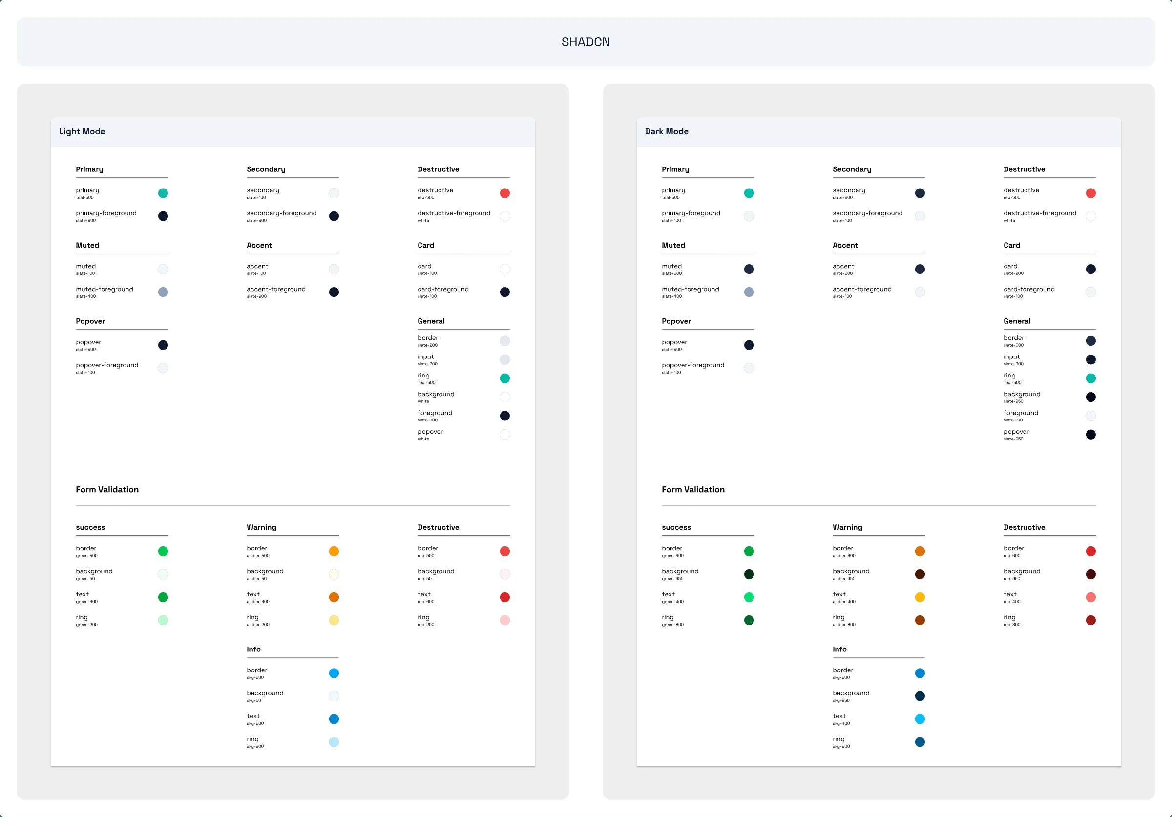
Every color in the system is documented three ways: the shadcn token, the Tailwind class behind it, and a swatch. A developer never has to guess what "that teal" is.
05 — Components
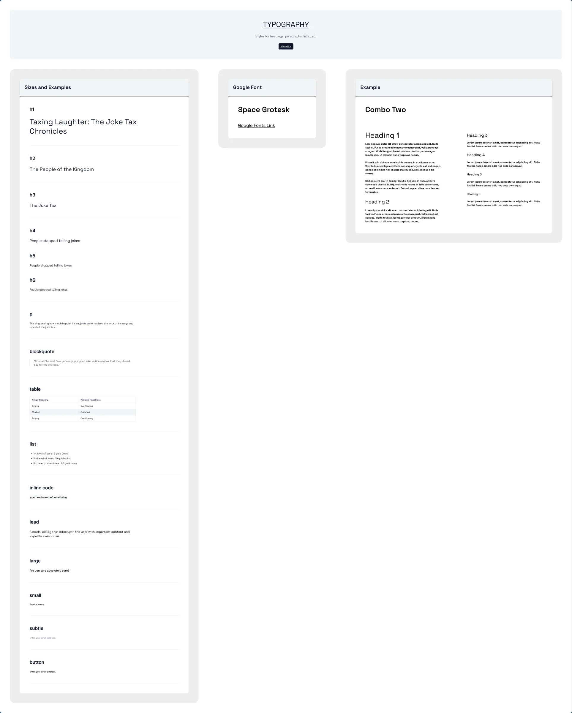
Buttons, badges, breadcrumbs, context menu, date picker, dialog, drawer, dropdown, grid, form groups, form validation, icons, inputs, navigation, read-only labels, radio buttons, switches, table, tabs, text area, tooltip, typography, page header, and animations. Each one has its own documented page.
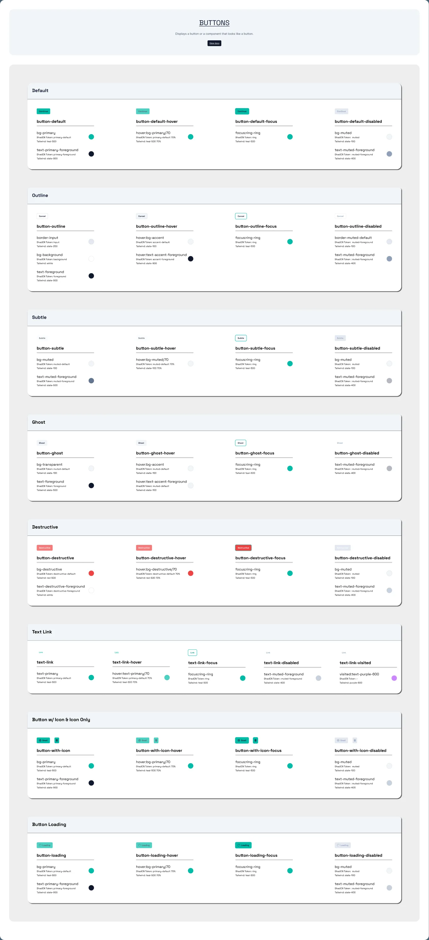
Every variant shows four states (default, hover, focus, disabled) with the exact token behind each one. Developers copy the class names straight across.
bg-primary/70, focus is ring, and disabled is bg-muted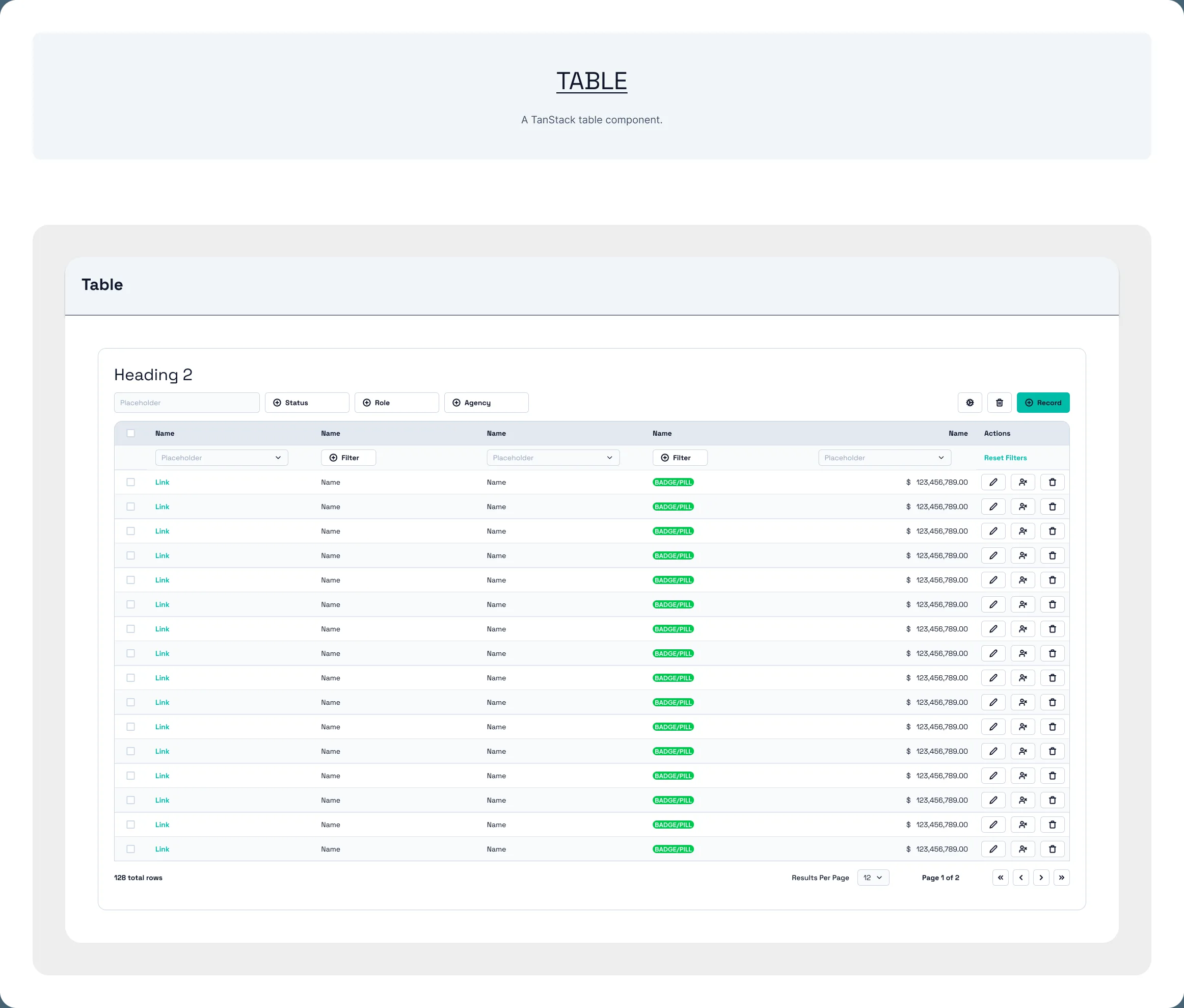
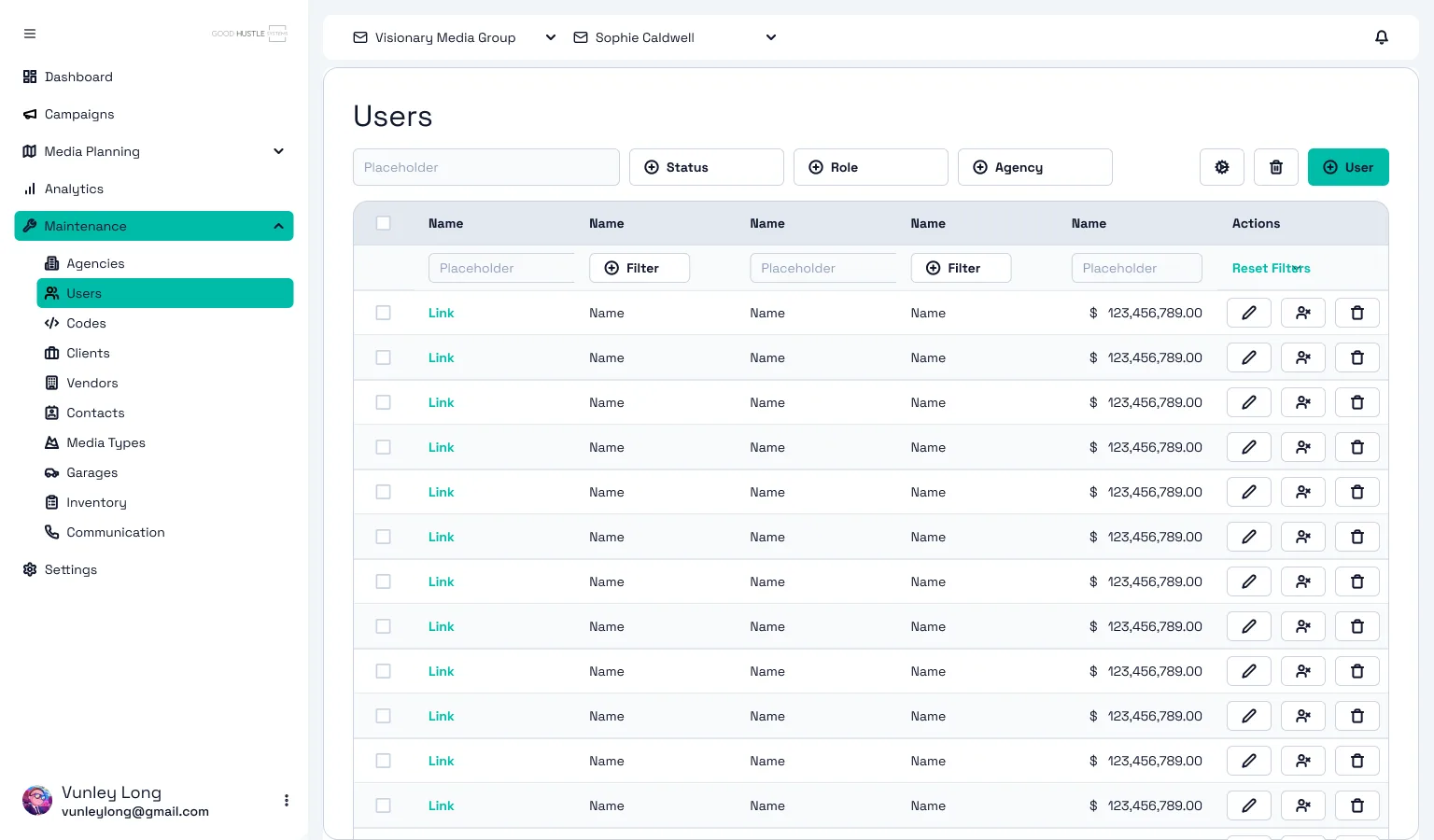
Agencies, users, vendors, inventory, and audit logs all live in tables. I designed one TanStack table component to cover all of them.
06 — Screens
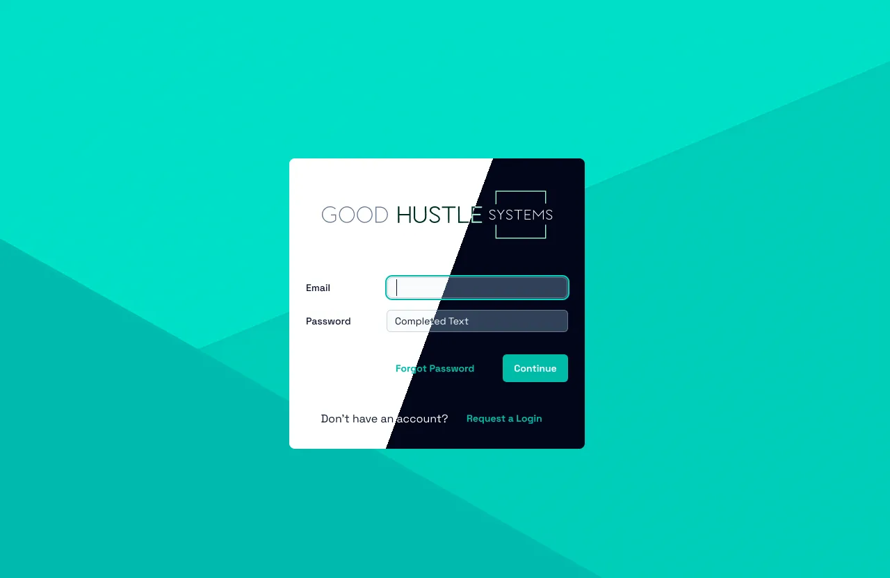
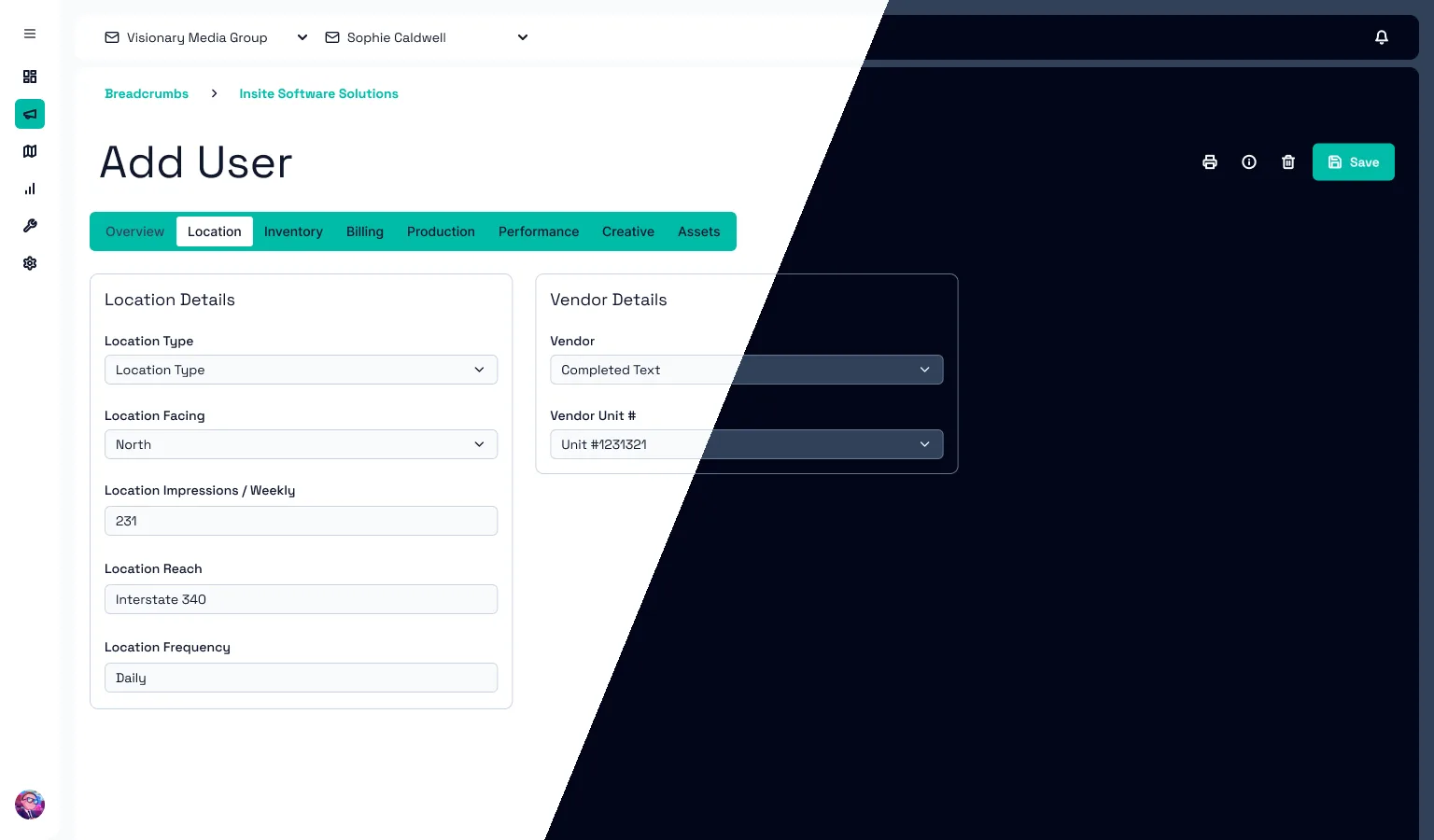
To prove the system, I designed the screens everyone touches first: login, user maintenance, agency administration, and the campaign plan detail page. Every screen exists in light and dark mode, and the drawers, dialogs, tabs, and date picker have clickable, animated prototypes.
07 — Outcome
Next project — 02
Personalization Center →